Campaign Editing Best Practices
When editing your marketing campaigns, keep these best practices in mind to make sure your emails perform well, deliver reliably, and clearly communicate your message.
General Best Practices
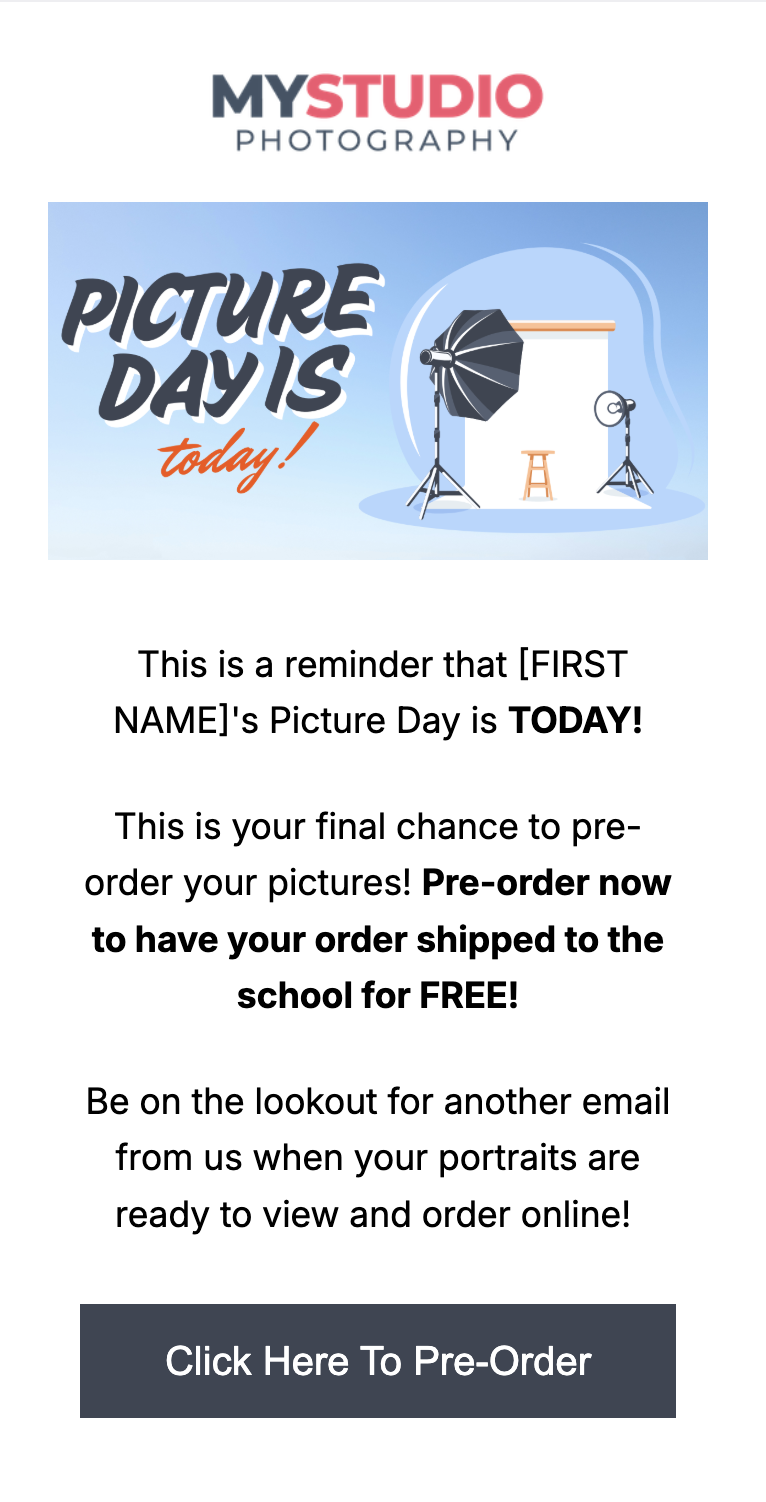
Keep key information above the fold so it’s visible without scrolling — over 70% of email traffic comes from mobile, making it important to place your most critical details at the very top.
Use short, clear sentences for easy readability.
Always include a clear call-to-action (CTA), positioned high in the email for visibility.
Keep fonts, colors, and logos consistent with your studio brand.
Subject Lines
Strong subject lines improve open rates. Aim for fewer than 60 characters and personalize with a first name or job title dynamic field when possible. Avoid emojis and spam-like wording.
Best Practices | Avoid |
|---|---|
“{{first_name}}, your photos are ready!” | “CHECK THIS OUT!!!” |
“Senior portraits are live for {{first_name}}” | “Important update” |
“Gallery closes Friday — don’t miss out” | “FREE GUARANTEED OFFER” |
“Save 20% today on {{jobtitle}} portraits” | “🔥🔥 Big Sale 🔥🔥” |
Graphics & Images
Clearly label your file names when uploading images so they are easy to find.
Be sure to not include special characters (%, &, *, etc) in your file names as Workflow will not allow them to upload.
Keep images under 1200 x 600 px
Compress images by 50% for faster loading on mobile and retina devices
Use optimized JPG or PNG formats
Aim for file sizes under 1MB for optimal deliverability and load times
Keep layouts simple — text-focused emails often perform best
Dynamic Images
Select Small or Medium size for dynamic images
Avoid using “Full Size” which can slow down load times
Always preview your campaign in mobile view before sending
CTA (Call-to-Action) Buttons
Place your CTA above the fold so it’s seen immediately
Use clear, action-oriented language (e.g., “Browse Products,” “View Gallery”)
Personalize CTAs when possible: “View {{first_name}}’s Gallery”
Use standard-width buttons for balance and readability
Choose button colors that stand out, but avoid designs that distract from the message


